To start this part of my project I wanted the packaging to be very simple but to also have a design on it. My first step was to look for a pattern that is bright and that is gender neutral as it is for girls and boys.


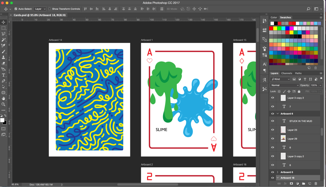
After testing these patterns out I realised that I needed something clean but something that also has a few colours so I decided to take a pattern that I really liked an altered it a bit for the packaging and for the back of the cards.
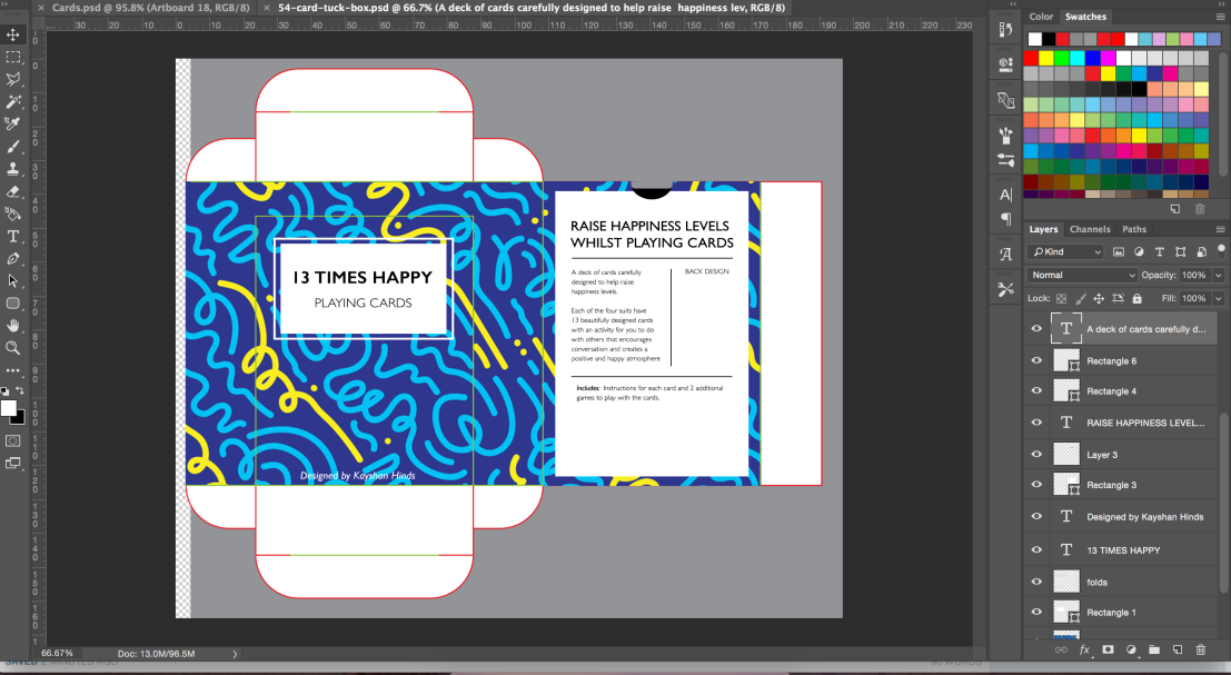
I decided to call the cards 13 times happy as there are 13 cards with actions on that should hopefully raise happiness levels. I did it so that on the back it would have an example of what the design looks and to give them an idea of what they will receive inside to invite them to purchase this.
I changed the design of the back of the card slightly so that the main colour would be yellow as it connotes happiness, sun, joy which all related to the concept of the cards.
I think perhaps to improve this I could think about testing some extra background colours and improve on the sizing of the border.
My next step is to fully design the cards and to make some improvements on the packaging so it is a finished product.