Some of my first ideas for this was to make a campaign about the hand and the way the hands craft all of the naturally made products. This was also because some of the products were handmade. I made a moodpboard for the way I would want the idea to look and just the type of overall feel it would have.
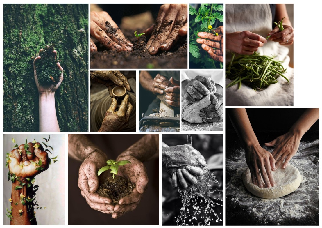 The idea for this was to show how dirty but amazing making some of these products would be and it would be based around really strong and powerful imagery. However a problem that I faced with this is that the brief it based around a relaunch in july and currently there was no awareness of the product or what it is even about so the strongest thing that I would be able to do was to first make customers aware of this brand and to stay on brief of what had already been written.
After working through the name with the client which would be called Zest of NeteRa( Zest meaning great energy and enthusiasm and NeteRa meaning natural) I started to construct some logos and put together what I thought would look best with the name. After working through some of these I came with a circle that would connote the earth and the way this brand was made with natural products and minerals from the earth and thought about incasing it within the earth. The colours were very dull and with the combination of this it looked very flat. So I went back to the drawing board and started to alter some of the designs.
![]()
I then tried some different variations with different type to see how it would look. I think the one that worked best was the green mixed with the different type. Which after some feedback I then decided to use and my final logo. I also had to clear this with my client.
![]()
This was the final result of the logo which connoted the green and natural shape of the earth.
