Tag: colour

Development

Screen Shot 2017-03-13 at 11.57.00

After making the outline of my illustration I then had to think about what type of colours I would want to use as the background to really enhance the details of the inside. I did not want to use the stereotypical colours of pink and blue although my illustration would be about stereotypes, so I chose much more subtle stereotypical colours.

As one of my main influences was isometric shapes I decided to start by creating the two rooms which would show each side of the stereotype.

To move further I think I will start to really outline each of the floors and put the main illustrations on the inside and then build up further. I also have to think about how my illuustration will go across the two pages and the transition of it.

Research – Monument Valley game

Whilst looking for ways in which I could create my design I came across this monument valley game which shows illustrations created in a block type of way. Each design has its own different type of work which I really like. I also like the way the colours each represent the different type of world that has been created. Also the type of shapes that are used also match the colours.

I think for my illustration I will explore using this type of work and whilst looking at their work I realised they use isometric shapes to design these worlds ,so for my work I will think about experimenting with this type of design

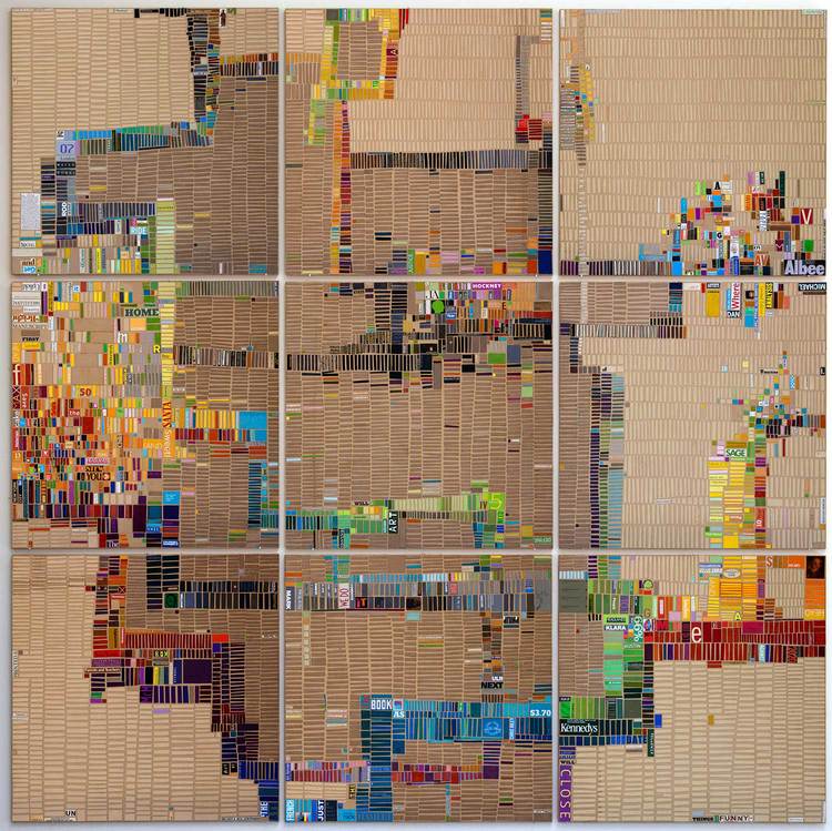
Laurie Frick – Daily walking Patterns

Walking_week42.jpg

After thinking about journeys I thought I would have a look at someone who has recorded their journey and put it in design. I particularly like this design as loads of different colours have been used and and have been formed in different patterns. It also shows you the beauty in journeys and the way it can be recorded.

I really like the way that It is on different canvases and all forms in one.

In this piece of work I think the main thing I will take away and think about incorporating would be the colours and the way all different colours combined can create something beautiful.

Final webpage designs

I created a walk through of what the webpage would look like and how it would work. I kept all the options as simple and minimal as possible to avoid the users loosing interest. I play with the colours and used al the colours from the logo and the architecture students designs to give it some co ordination and flow.

Throughout making these webpages I had been consulting with beliz as she would be making the pop-up brochure that would like with my webpage designs, We had been co ordinating the designs and linking the colours to show what you would be receiving in the post.

Some of the problems I faced whilst making these webpages were things like;

  • layout
  • colour
  • direction

I found that when I was trying to layout the selection circles I had to carefully think about how big they would be and if the smaller circles will be able to fit in once selected.

I also faced a small problem with whether I should have two different type of selection choices but once receiving feedback from my tutor he said the safest thing to do is to stick to one selection choice to avoid confusion.

Final digital poster

output_cr7PJg

This is my final digital poster which I had only made a few changes from my draft. Initially I had tried to make this in to an actual moving digital poster, which had not worked out well as I had thought it would as I did not have the skills. Some of the steps that this would take would be

  1. clock would be ticking blank
  2. when someone walks past toast pops out
  3. shows ‘buy your freshly baked bread now!’

To make this digital poster much better I would think about the way I have mixed animation with images and if I could merge them better or put them along one platform. I could also think about the way i manage my time.


storyboard

For my digital poster I started by making a short rough copy of what I would want it to look like. I thought about what kind of props I would like to have in my digital poster and compiled them together so I know what it would look like. I placed text on the piece of toast as it is the main part of the image.

To move forward I will need to think about how to make the digital poster recognisable to my brand, I also need to think about the way that my audience may interpret the text that would be on my digital poster.

Improving my packaging

new packaging

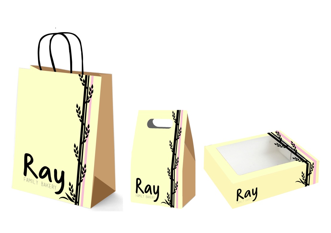
After receiving my feedback I had decided to use a flat image of wheat and have it printed on my packaging. It gave my design a bit of an edge but still helped to keep it simple and would be easily recognisable. Once I had designed this I got a lot more feedback about how much better it looks as a set and you understand what kind of shop it would be for.

Each of the different packaging is meant for different types of product. The first big back is for overall stuff from the shop so it is a big bag. The second little bag is for if you were to buy different types of breads or smaller loafs or slices and the last big box is for a loaf if you were to buy it separately.

Packaging

This here is my packaging that I have put together. My brand is a family bakery so I wanted to have the type of packaging would see in a bakery. As my target audience is for women aged 55-64 I needed something simple and classy but something that also feels homely. That is why I chose a nice soft colour with a touch of femininity

After receiving some feedback people had told me that the packaging needed something more to help it look less clinical but also to keep the simplicity and elegance.

Presentation board – Formative

presentation board.jpg

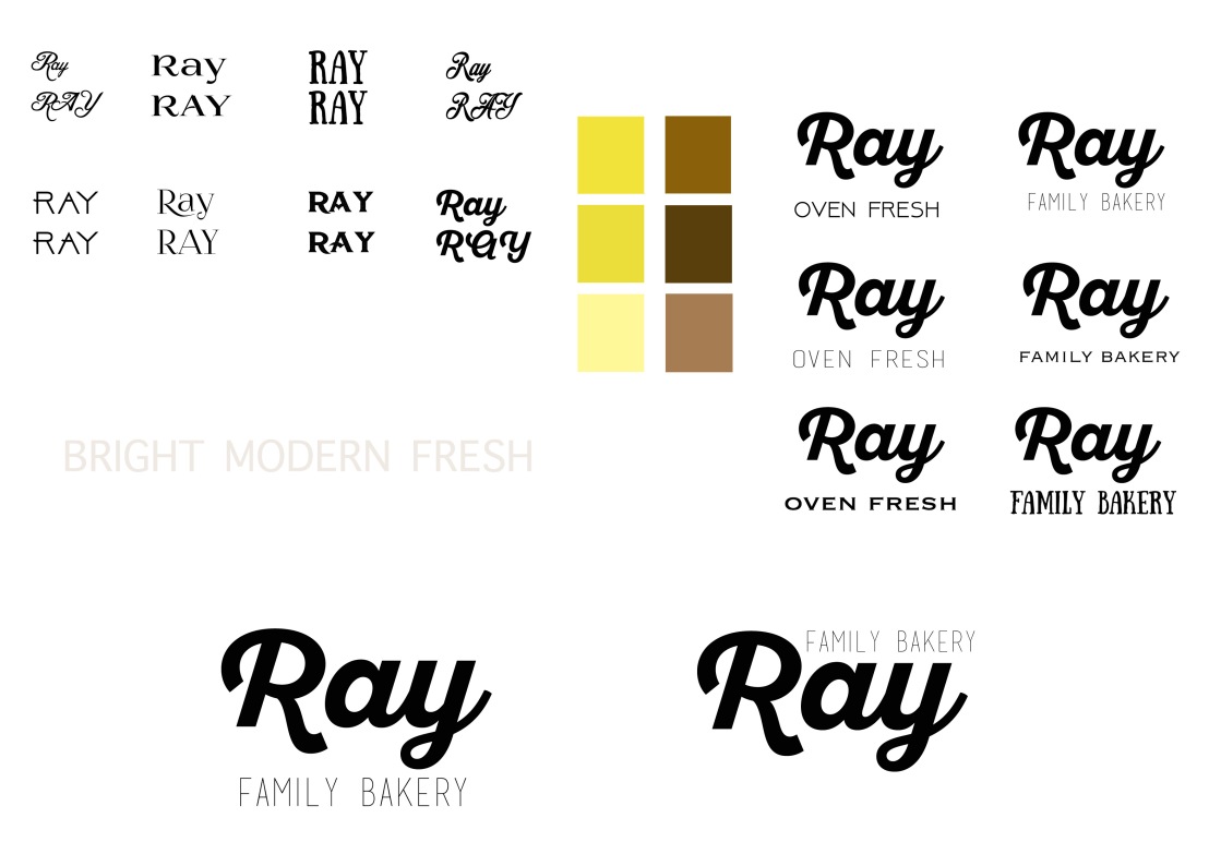
From my formative presentation board I received some feedback from people and they had thought the first logo looked really placed and not merged in with the logo. Then I received feedback from the second logo at the bottom where people had said the family bakery on the top doesn’t make sense because people generally think read from up to down.

To move forward with my ideas I will start to think about where I can place my tagline and if changing the font will help improve the way the logo looks.